Overview
Pain 100 is dedicated to providing immediate, expert support to individuals who have been involved in accidents, connecting them to qualified legal referrals and experienced medical professionals. When Pain 100 approached us, they wanted a website that highlighted their helpline number, and conveyed urgency and trustworthiness. Our goal was to design their site with a focus on making the helpline number impossible to miss while ensuring the user experience was seamless, clear, and focused on quick action.
Challenges
- Visibility of the Helpline Number: Pain 100 wanted to make their helpline number the focal point of the website, ensuring that users could easily find it in moments of need.
- Urgency and Trust: The previous website didn’t adequately communicate the urgent nature of their services. Visitors needed to feel confident that they could quickly connect with trusted legal and medical professionals.
- Cluttered Navigation: The old site had a complex navigation system that didn’t offer the most efficient path to getting help or finding relevant information.
- Mobile Optimization: Many of Pain 100’s visitors would need to access the site from their mobile devices, and the previous website wasn’t optimized for this type of use.
Solutions
To address these challenges, we worked closely with Pain 100 to redesign their website, prioritizing a clear visual hierarchy and a user experience that guided visitors toward the helpline number and immediate action. Here’s what we implemented:

Key Components
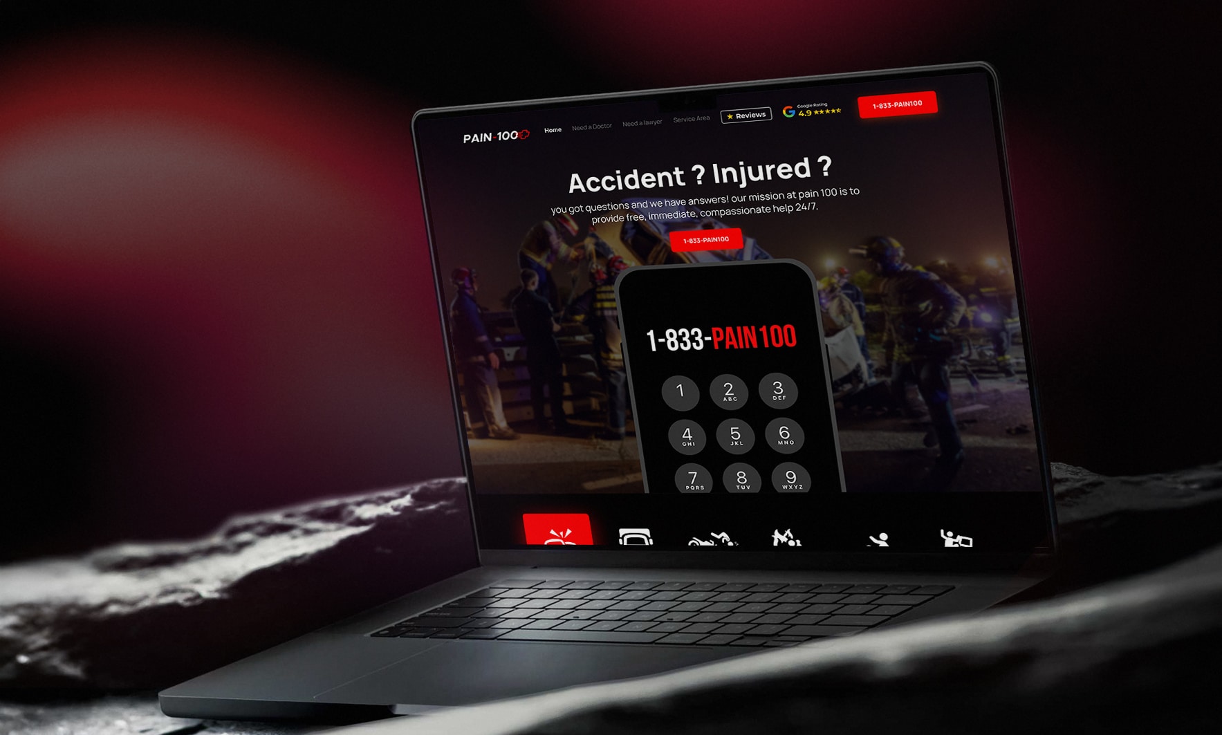
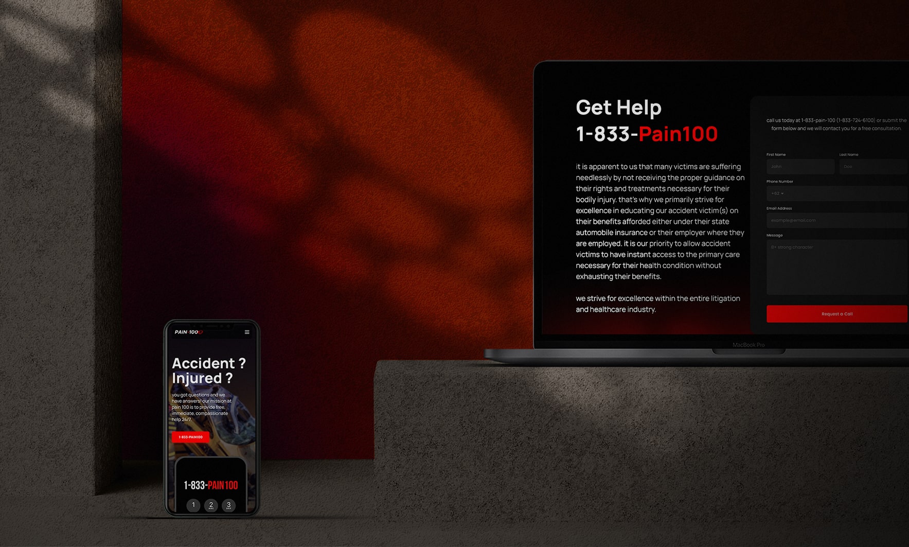
- Bold, High-Impact Design: We used a striking black theme with bold red and white accents to grab users’ attention. The red accents symbolize urgency and action, perfectly aligned with the nature of the service. We made the helpline number larger and more prominent, placing it in bold, easy-to-read font across the website.
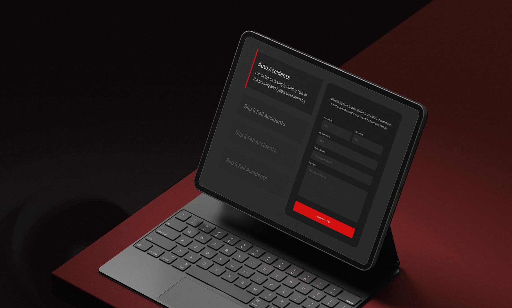
- Clear Call-to-Action (CTA) Buttons: To encourage quick action, we placed bold CTA buttons throughout the site. These buttons lead users to either dial the helpline directly or submit an inquiry form. The buttons are strategically placed near the top of the page, in the center, and after key sections of content, making it easy for visitors to take immediate action.
- Urgent Messaging: The website’s content was revised to clearly communicate the urgency of getting help immediately after an accident. Each page features concise, direct messaging that prompts users to call for immediate legal and medical support.
- Streamlined Navigation for Quick Access: We simplified the navigation to focus on the most essential information: how to get help, the types of services offered, and how to contact Pain 100. This eliminated unnecessary clutter and allowed users to quickly find what they needed.
- Mobile-Optimized Design: Given that many visitors would likely access the site via mobile devices, we made sure the website is fully responsive. The helpline number and CTAs are large and easy to tap on smaller screens, ensuring that users can reach out for help quickly, even in emergency situations.
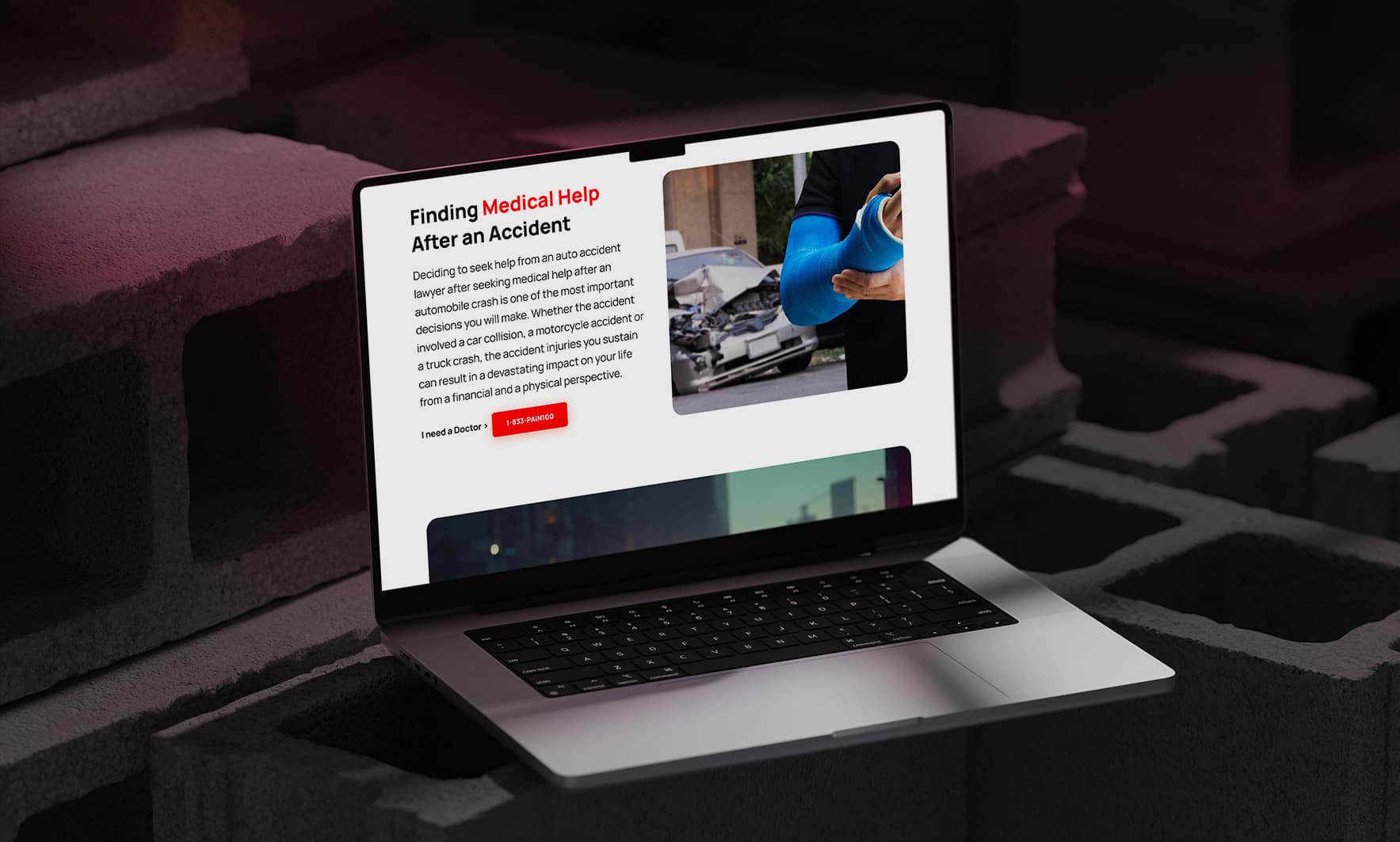
- High-Impact Visuals: The website features bold, high-quality images and icons that convey professionalism and trust. The visuals are used strategically to highlight the helpline number and create a sense of urgency without overwhelming the user.

Effective Results
- Increased Call Volume: By prominently displaying the helpline number in large, bold font throughout the site and incorporating multiple, visible CTA buttons, Pain 100 has seen a significant increase in the number of calls to their helpline. Visitors are able to take action immediately, increasing response times and helping users get the help they need faster.
- Improved User Engagement: The improved design and clear CTAs have made it easier for visitors to engage with the site. Users are spending more time navigating the pages, and the site is guiding them toward taking the next steps—whether it’s calling the helpline or filling out an inquiry form.
- Higher Conversion Rates: The combination of urgent messaging, bold CTAs, and an easy-to-use layout has led to higher conversion rates, with more users submitting their details for referrals or directly calling the helpline.
- Stronger Brand Trust: The sleek, professional design—paired with a clear, no-nonsense approach to user experience—has improved how Pain 100 is perceived online. Visitors trust that the service is reliable, immediate, and user-focused.
- Enhanced Mobile Experience: The mobile-optimized design has resulted in an increase in mobile user engagement, with visitors accessing the site on-the-go and easily dialing the helpline with one click.
- Positive Feedback from Clients: Clients have reported that the new website is much easier to navigate, and they feel more confident in reaching out for help thanks to the clear, urgent design and user-friendly experience.
Pain 100’s newly redesigned website is now a powerful tool that not only improves user experience but also reinforces the sense of urgency and professionalism that their brand represents.


